Search here
 Log In
Behind The Badge
WALT DISNEY
Here’s a fun fact for you: The Walt Disney signature you can see on virtually every piece of Disney media ever produced doesn’t actually look anything like Walt Disney’s signature. In fact, the iconic, globally recognized symbol of the company isn’t even based on Walt’s signature — it’s based on an employee’s version of it. As you can imagine for a company of Disney’s size, even in the early days Walt Disney just didn’t have time to sign every piece of fan mail that came his way. As such, it was common for him to pass off this duty to a secretary or other employee who’d been given permission to sign things on his behalf
METRO GOLDWYN MAYER LIONS
The MGM lion is one of those logos that’s reached almost mythical proportions. The logo has undergone several significant changes over the years, which is our roundabout way of saying that they replaced the lion when it died like four times. For example, when Slats, the first lion used by MGM died, his body was buried beneath a giant marble slab. When asked why, Slats’ trainer said that it was to “hold down the lion’s spirit,” Similarly, the second lion used by MGM, Jackie, survived a train crash, a plane crash, an explosion, a boat crash, an earthquake and then another train crash. So the next time you watch a movie and happen to see the MGM lion at the start, remind yourself that you may be looking at a lion that survived three Liam Neeson movies in a row.
NESTLE
The Nestle logo was designed in 1868 by Henri Nestle, based on the meaning of his name in German. The logo also included a little nest, and his family emblem. Later on, as the logo evolved, the mother bird’s beak was removed and the three fledglings were reduced to two to depict an average modern family.
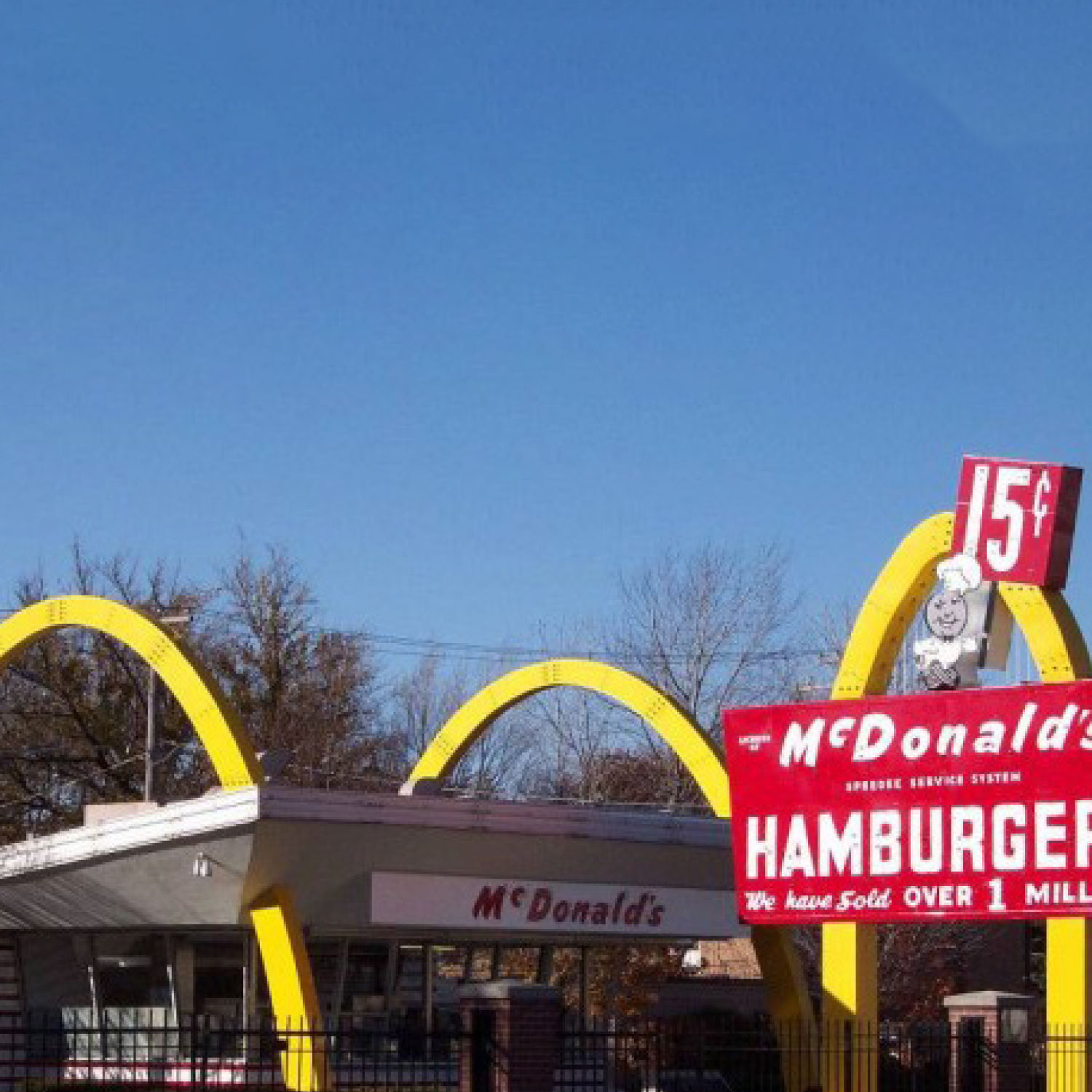
MCDONALD’S
McDonald’s is one of those brands that will likely outlive us all. You’d assume the big “M” that forms the Golden Arches was derived from the word “McDonald’s” because, well, there’s an M right there at the start of the word, but you’d be wrong. The Golden Arches are actually based on the shape of the original McDonald’s restaurants, which featured prominent, golden archways as a way of making the buildings stand out. The idea of including the archways can be traced back to architect Stanley Meston, who proposed the idea as a way of diverting rain away from queuing customers and motorists.
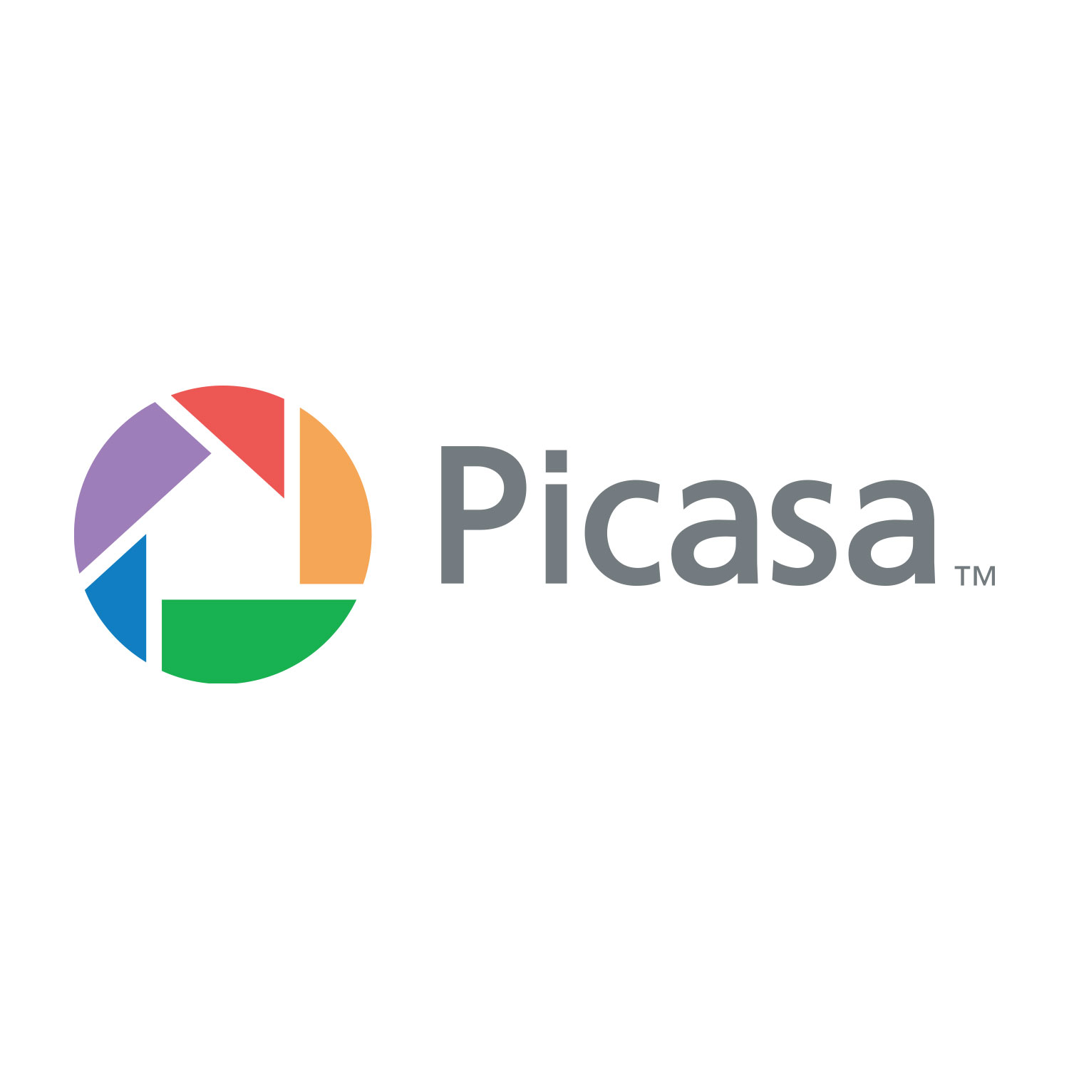
PICASA
By the looks of it, the logo seems to represent a camera shutter. But that’s not the only thing. The name Picasa is based on the Spanish word Casa, which means home. The motive behind the logo was to indicate that the site houses all your pictures. Look carefully and you’ll spot a house in the middle of the colourful shutters!